How to make your city comfortable and beautiful: design code and solutions for every citizen
November 8 is World Urban Day. We explain why we still suffer from the visual chaos on the streets of Ukrainian cities, what solutions are there, and what everyone can do.
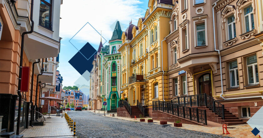
What is the problem?
How long ago have you walked around your city, and everything around you was pleasing to the eye, not an inner feeling of chaos? We're now talking about abundant signs, chaotic parking lots, bike paths that are abruptly interrupted, streets where you need to go around the terraces that stand on the sidewalk, broken pedestrian crossings, high stairs, poorly built curbs that are easy to cross.
If you have to walk to work, your path may run through a long blank fence or a concrete box building. You're likely walking along an endless noisy square that won't bring pleasure; it's difficult to call it a walk because you want to overcome the visually empty space crowded with car noise as soon as possible. The list of uncomfortable moments for a citizen can be endless, and each of the readers will add something to it. On the streets of Ukrainian cities, inconvenience isn't an exception, but a routine, the responsibility for which lies with local authorities and citizens themselves. What is being done in other cities to make them more comfortable to live in? Answer: they develop design codes. Rubryka analyzes what it is and why.
What is the solution?
What is design code?
The design code of the city is the general rules of the city design, which may be invisible to the average person, but at the same time make the space clear, easy to perceive and move, and most importantly, safe, with convenient infrastructure.
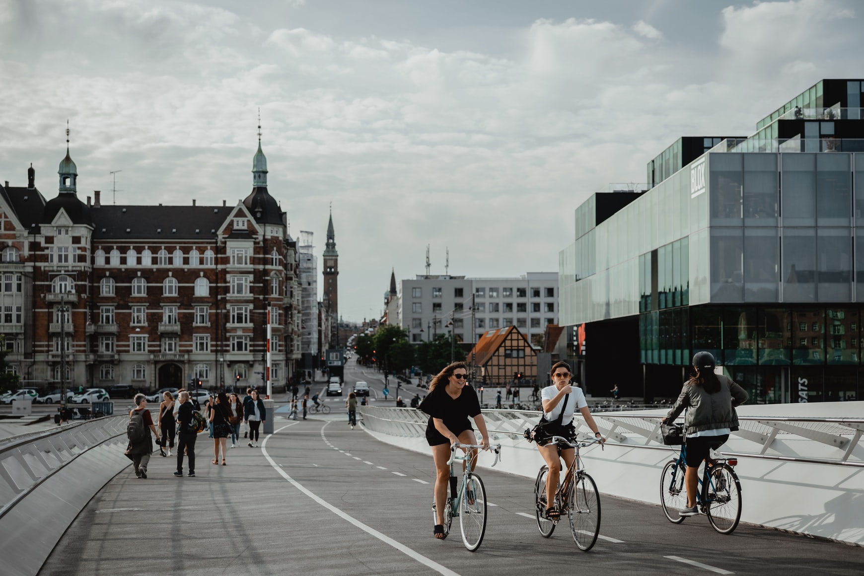
A great example in every sense is Copenhagen, Denmark. The comfort of living in Denmark lies in the environmental and reliable infrastructure of the capital. Copenhagen is a very convenient city for pedestrians, it's better only for cyclists. More than 480,000 people (40% of the city's population) commute to work by bicycle every day, making Copenhagen the most cycling city in the world, with a total traffic path of 350 km for cyclists. Public transport also has a well-developed network of high-speed trains, subways, and buses. Locals prefer bicycles or public transport, as there are certain obstacles for drivers: some of the highest gasoline prices in the world and a tax of 4 Krones per liter.
A design code is often described as a set of rules that you can take after to follow an example. For example, Copenhagen has been introducing roadblocks gradually since the 1960s, when the authorities considered reducing traffic in the city. Strøget Street was the first to be blocked in 1962 when the decision was perceived as skeptically as Kyiv residents now perceive Sahaidachnoho Street blocked in Podil. But in the first year alone, according to a study by Danish architect Jan Gehl, the number of pedestrians increased by 35%. Therefore, between 1962 and 2005, the area of pedestrian Copenhagen increased from 15 to 100 thousand square meters, and the entire city became the most comfortable for cyclists: with separate lanes, protected from the roadway by parked cars and special traffic lights for cyclists.
This approach, tested in the center, is now used in more remote areas of Copenhagen. The known procedure and already developed schemes are the design code. In the footsteps of Copenhagen, we see, for example, New York, where the intensive expansion of opportunities for cycling began in 2007.
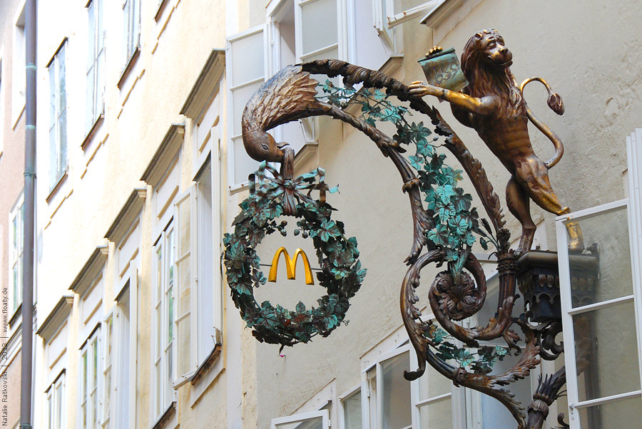
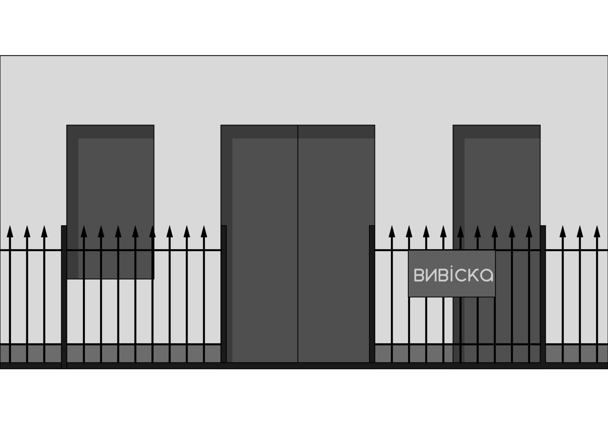
Salzburg, Austria can show another example of a design code that controls the order of advertising on the streets. If you were walking through the historic center of the city, you should have noticed the elegant wrought-iron signs. But did the owners of shops and cafes decide not to compete with each other for the brightest, most brilliant inscription, preferring aesthetics to the detriment of competitive advantage? No.
The fact is that all outdoor advertising here is subject to the law of the mayor of Salzburg, which prohibits any kind of modern sign. Therefore, the main trend is a large number of signs and bracket panels made of metal. This is dictated by the architectural features of the city, as metal is much more suitable for decorating the facades of old buildings than modern materials. The oldest street Getreidegasse is famous for its medieval buildings, which still house restaurants and fashion boutiques. Even the famous McDonald's completely "dressed" their logo in wrought iron flowers with petals. Metal letters that attach directly to the wall are also popular here. Illuminated signs in Salzburg are very rare.
As a result, the city looks neater, more interesting, which, in turn, affects the aesthetic satisfaction of all who are in it and, of course, the popularity among tourists.
How will it work in Kyiv?
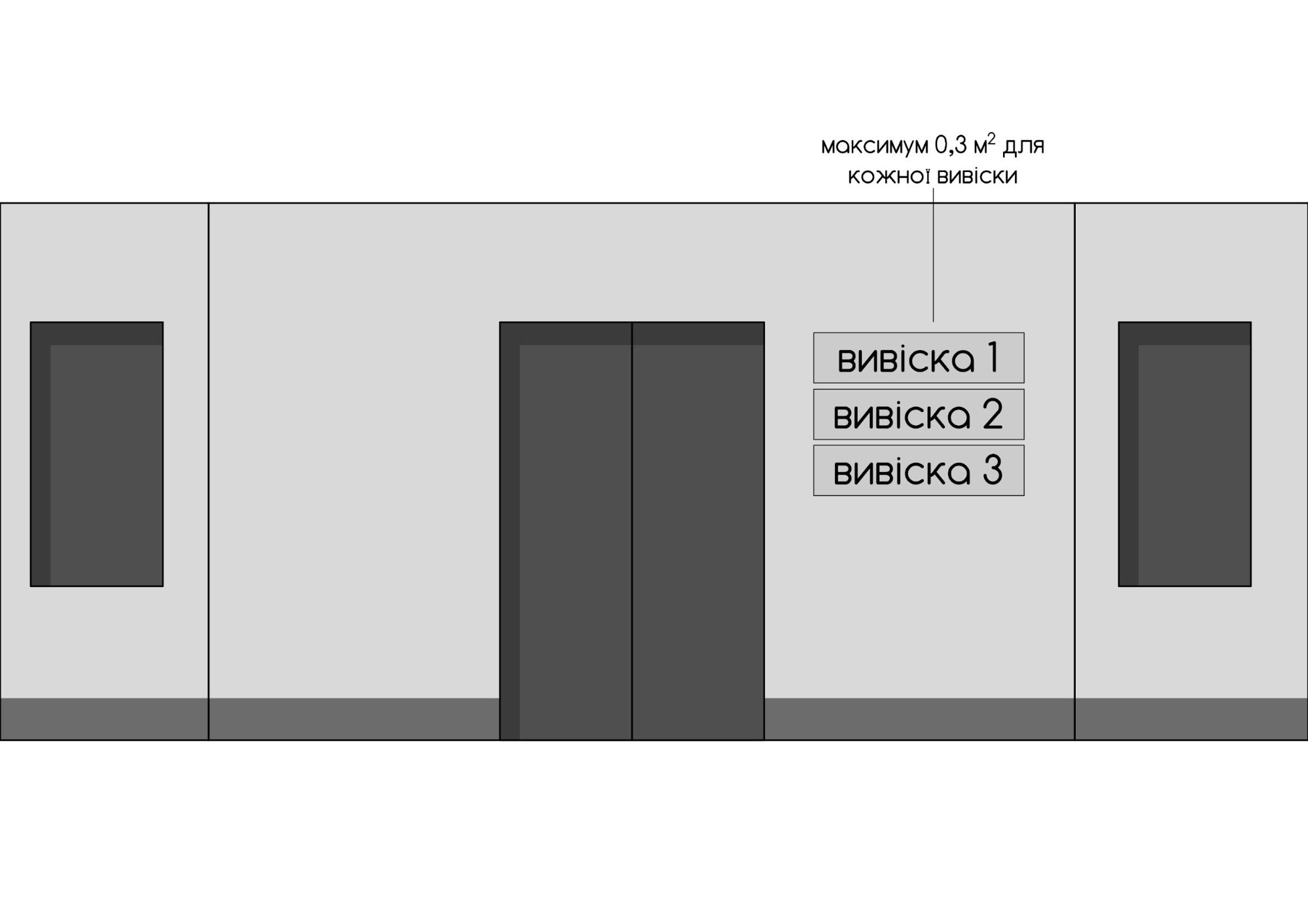
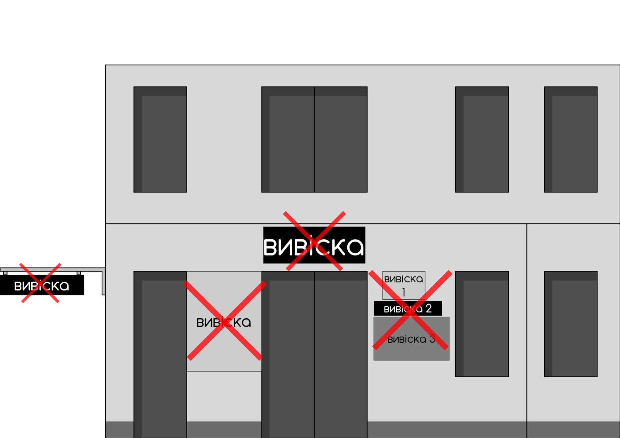
In Ukraine, the movement for cleaning the urban space from visual waste is just emerging. It is usually headed by people who are not indifferent to the fate of cities: entrepreneurs, developers, architects, designers, photographers, just caring citizens. In Kyiv, this role was performed by the Ukrainian Association of the Visual Industry, which developed a design code for the city in the form of a procedure that was later approved by the Kyiv City Council. This, of course, is only a small part of the design code, which regulates only the order of placement of information signs, not advertising. A sign is an architectural form that:
- has the name of a legal entity and names the type of its activity, for example, "Ivanov's Law Office. Legal Services"
- may contain information about working hours
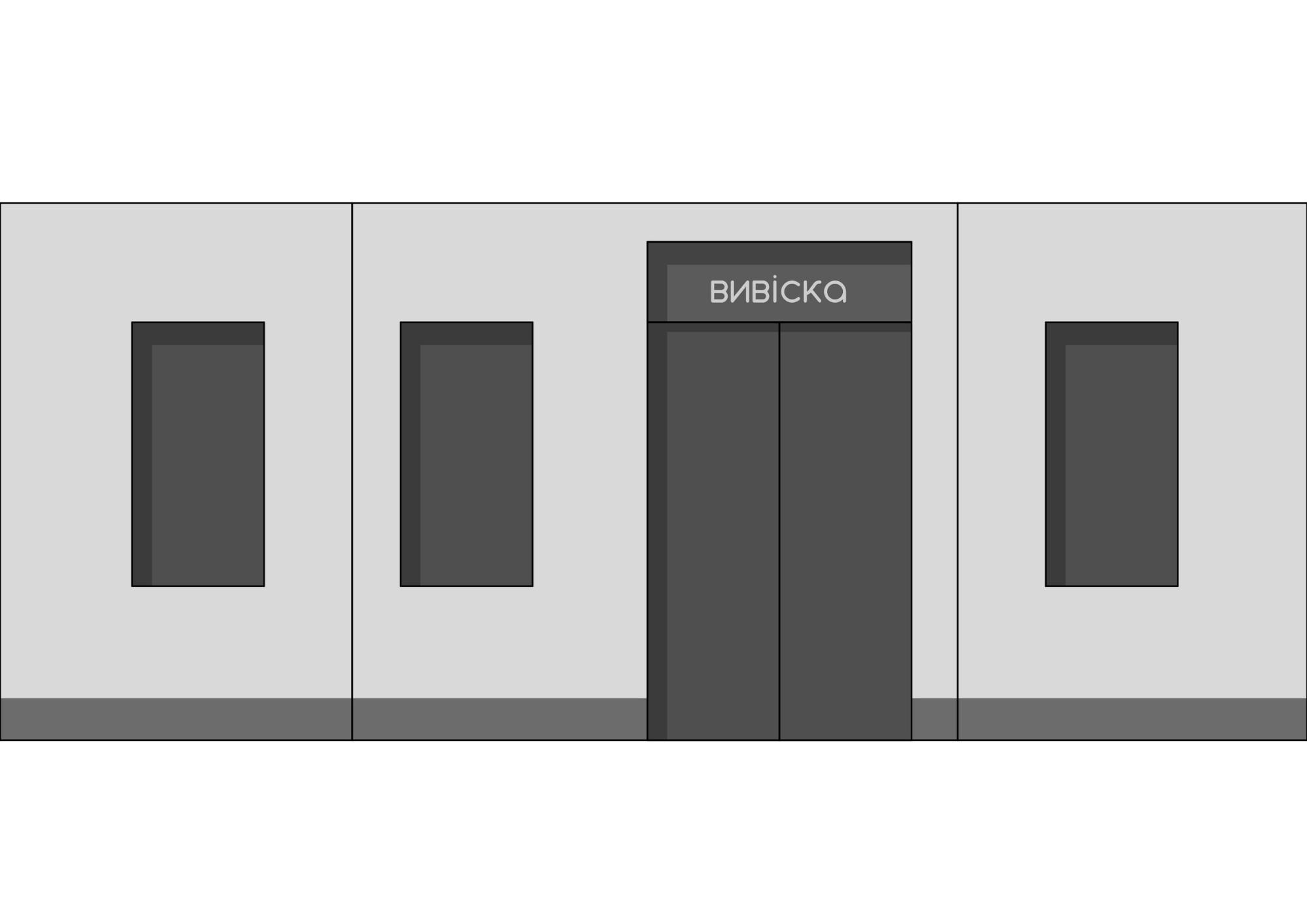
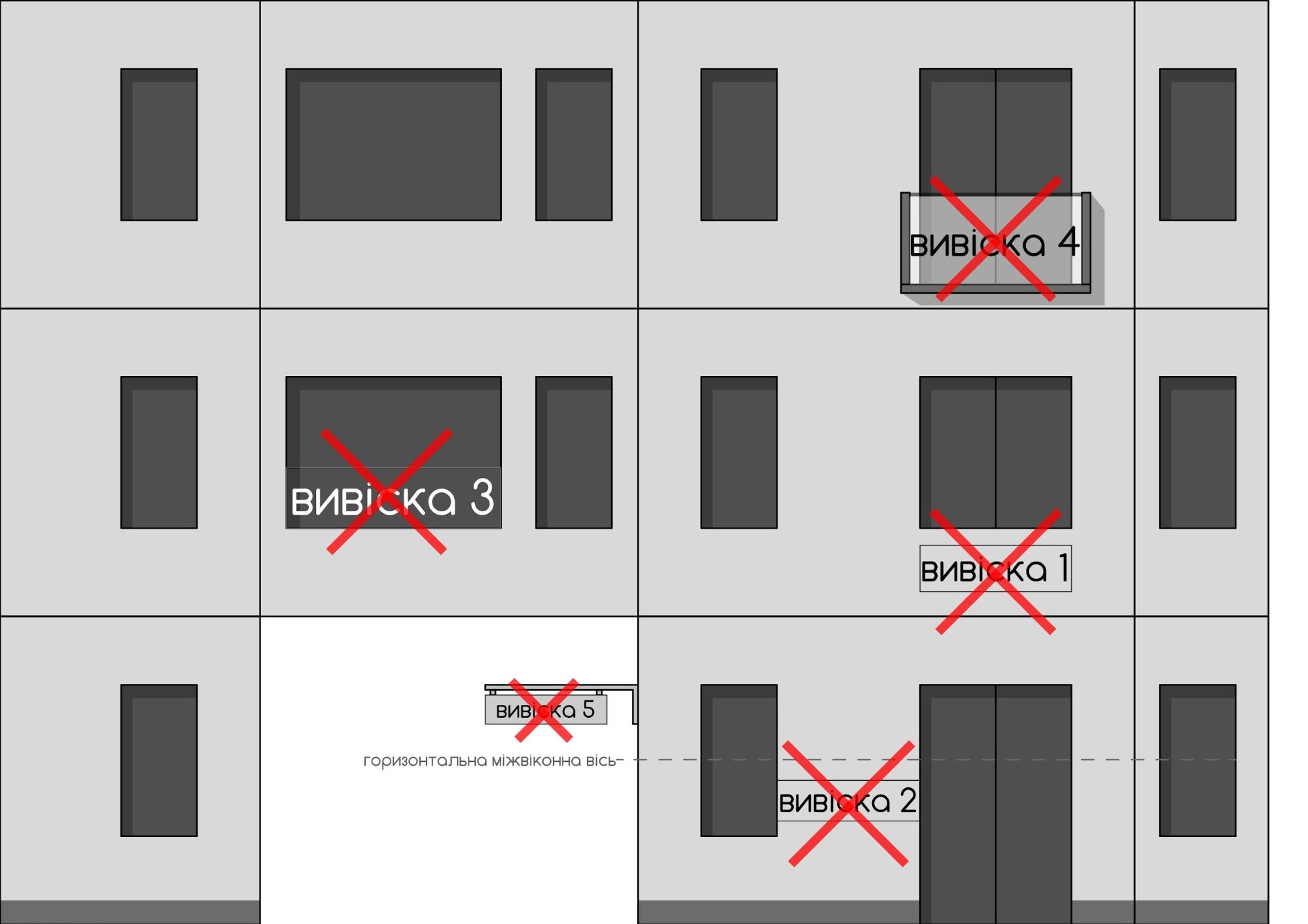
- is located on the facade of the building not higher than the 1st floor. It can be above the entrance or on the window, not occupying more than a third of it. The sign itself should not be larger than 3 square meters.
- if there is only one entrance to the building, shared by several shops or cafes, signs should be proportional and made of the same material.
There is even a rule that states that within the historical part of the city signs are recommended to be made of natural materials (metal, ceramics, wood) and traditional techniques (forging, casting, engraving, stained glass, bent glass, enamel, painting, mosaic), and so to make the sign look harmonious on the facade of the building. Imagine how beautiful the city would look if this rule was mandatory, or at least if entrepreneurs followed this recommendation.
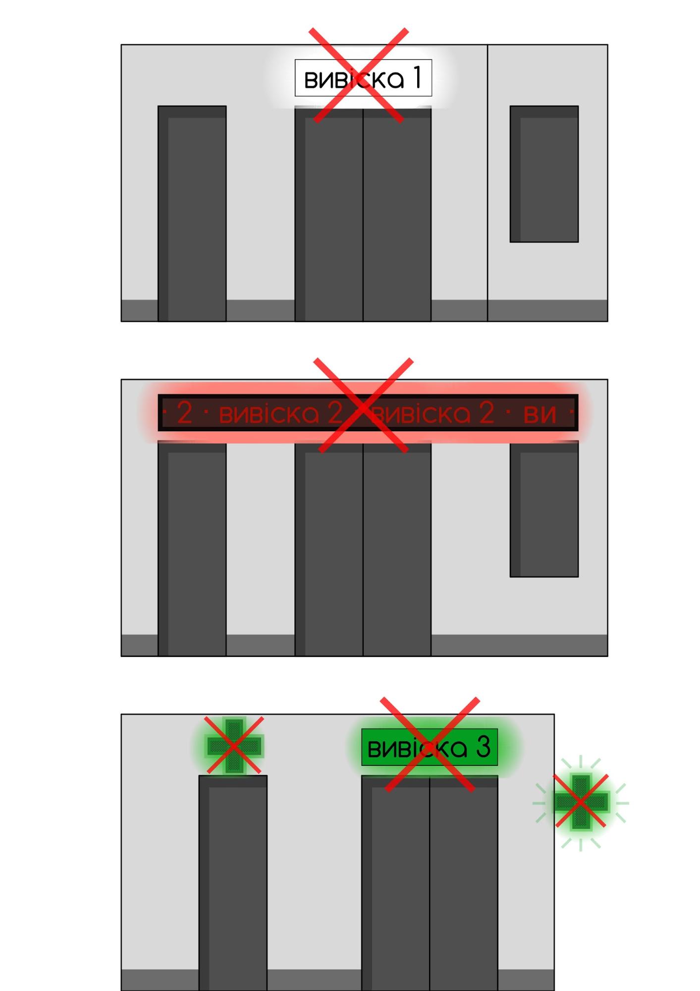
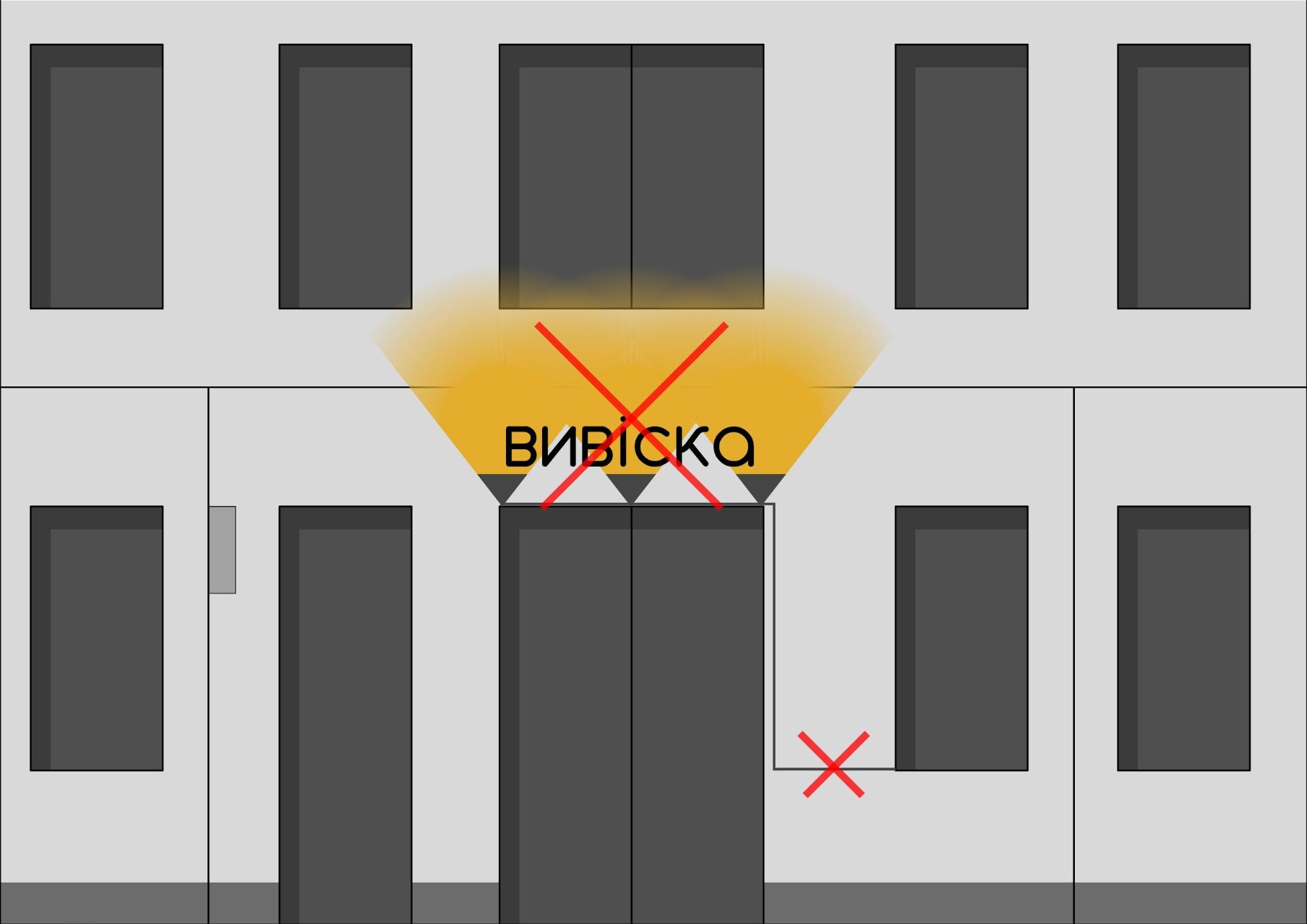
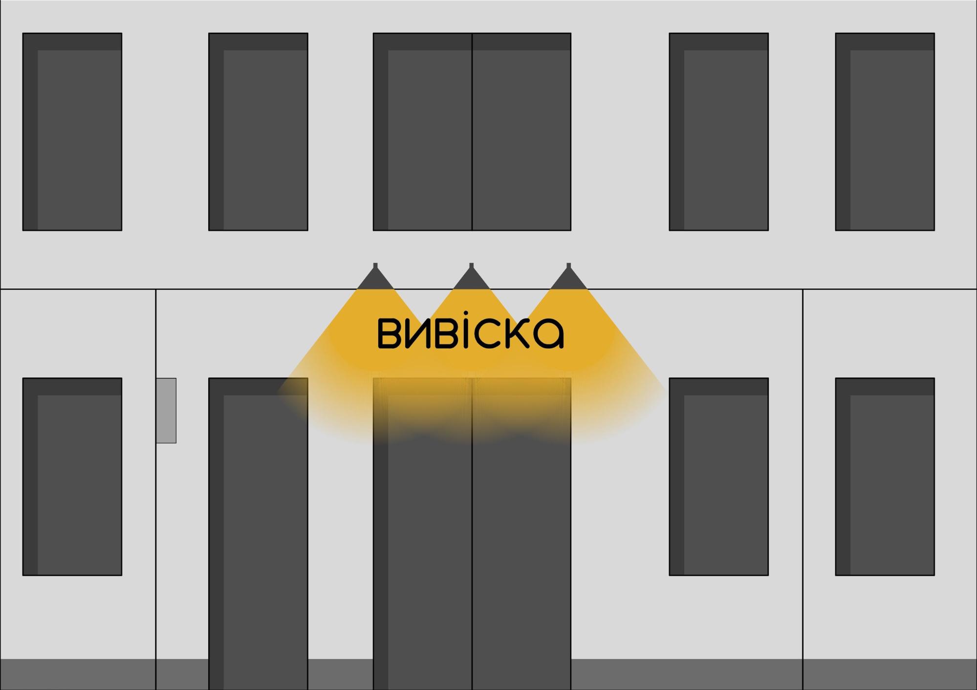
As for the lighting of signs, then here our entrepreneurs often violate the law. For example, bright green flickering "PHARMACY" signs that strike the eye are a violation because the rules say that the light from the signs should not blind road users or interfere with the lighting of residential or non-residential buildings. This means that if every night you are prevented from falling asleep by the signal light of a sign near your window, you can safely complain! Where exactly we will tell below, right after we'll dedicate you to the concept of one more constructive element. These are ruthless tablets.
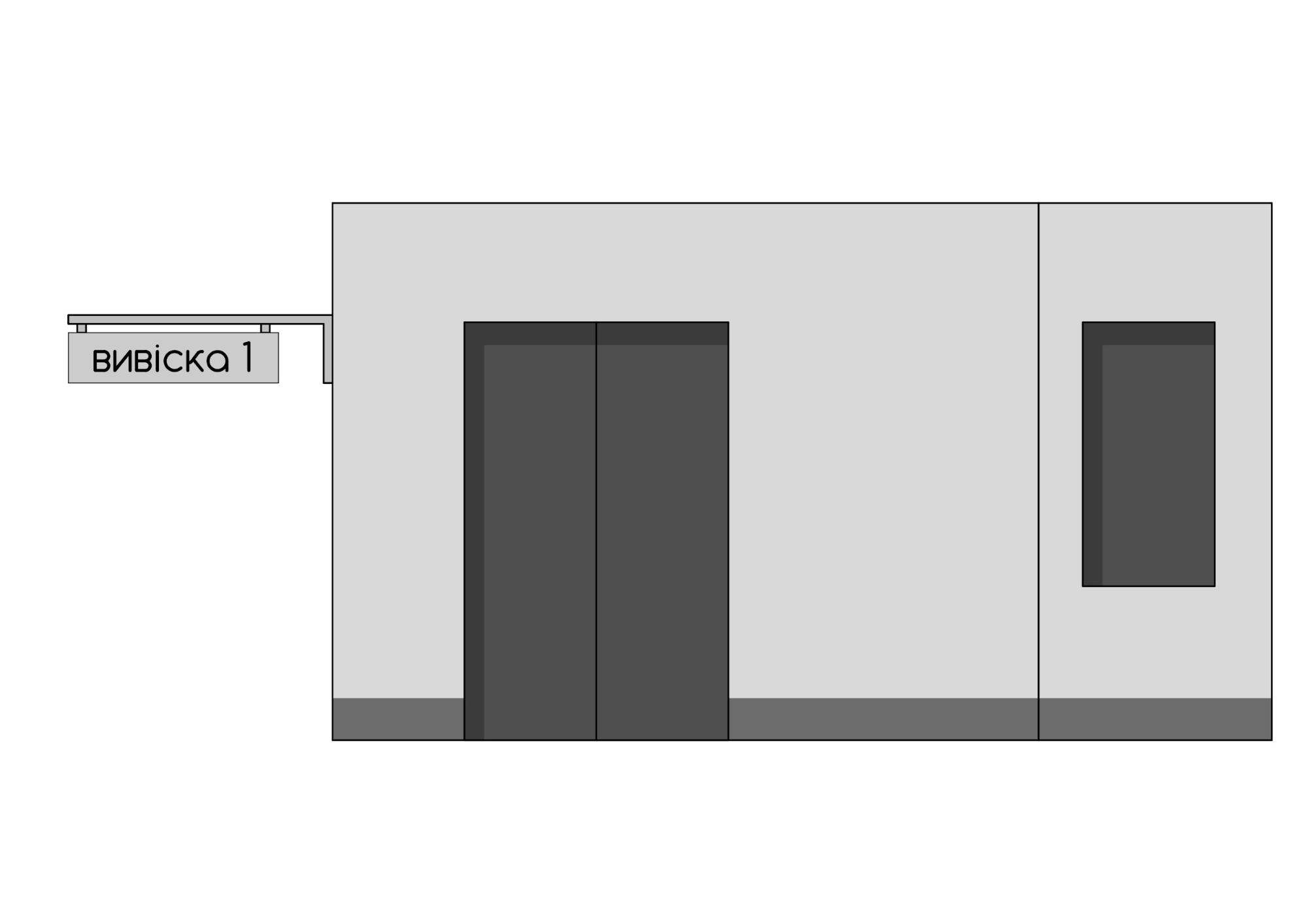
Entrepreneurs reach the apogee of creativity by drawing a variety of signs, relying on their artistic taste, and trying to stand out. The tablet is almost the same as the sign, without restrictions on height, but with a restriction on size; it shouldn't be more than 0.5 square meters. For example, 70 by 70 cm.
It's not required to notify the authorized bodies about the placement of the sign, but the location of the sign must be agreed with the Kyiv City Administration. The Kyivreklama utility company monitors the correct placement of signs; administrative liability is provided for violation of the procedure for placing signs and advertising tablets. Therefore, you can complain about the incorrect placement of signs and tablets in several ways:
- to the police, by writing a statement or calling squad number 102, if you found violators at the stage of installation;
- to Kyivreklama, writing a complaint in free form to e-mail or the physical address of the enterprise.
Those signs and tablets that were placed in violation of the norms set by the Kyiv City Council will be dismantled.
How will it NOT work?
Signs are not the only thing. We don't have a common architectural style or even a general plan of the city
Of course, signs alone don't solve the problem. Bohdan Hdal, a designer from Kyiv who designed the font for the new metro stations and an activist, fighting to create a public space in Teremky, says that besides the legally regulated rules for signs, it would be good to create requirements for the appearance of street furniture because "the city is really like a hell-hole without such restrictions."
"If you dig deeper [talking about the design code – ed.], you can agree on the global concept of city aesthetics, the general plan, the architectural styles. At present, there is certain anarchy in all this," he said.
As for the city general plan, it hasn't been approved for several years. There's only a general plan until 2020, approved 20 years ago, in 2001, and a draft until 2025. The lack of a general plan gives room for manipulation by the city to allow or not to allow construction in certain areas of the capital in each case, citing the lack of an approved general plan.
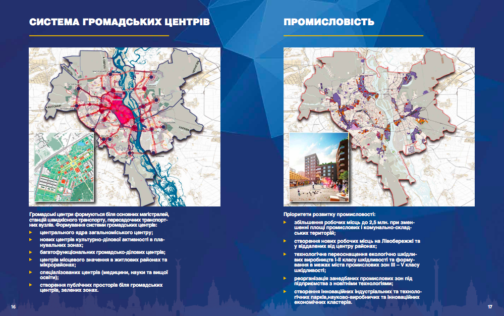
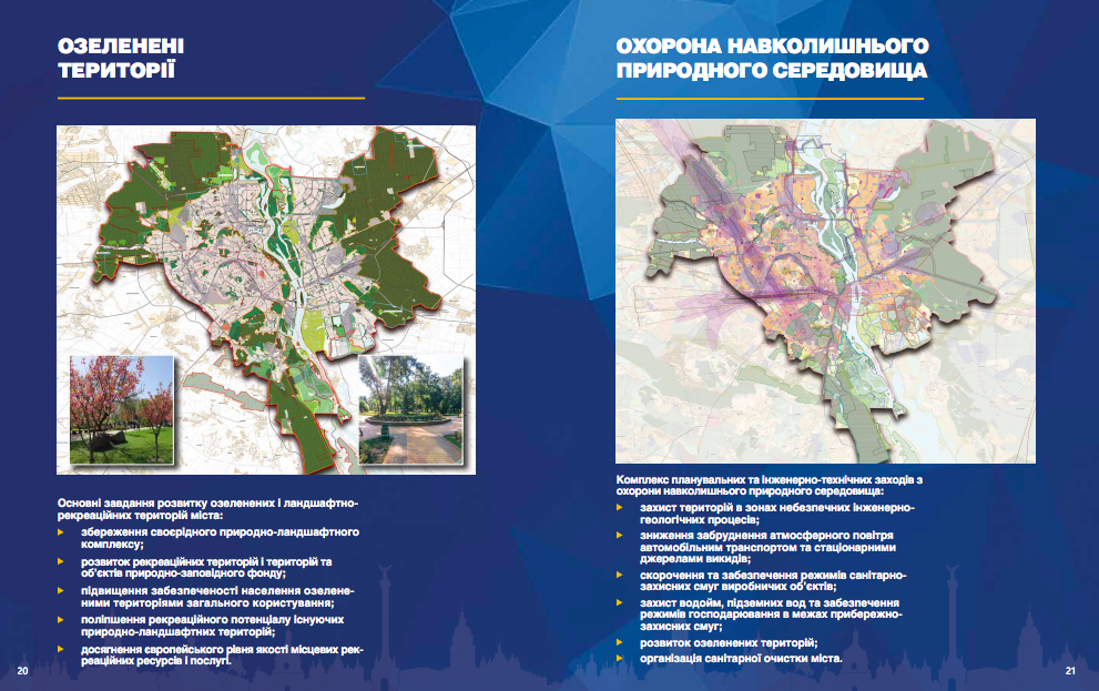
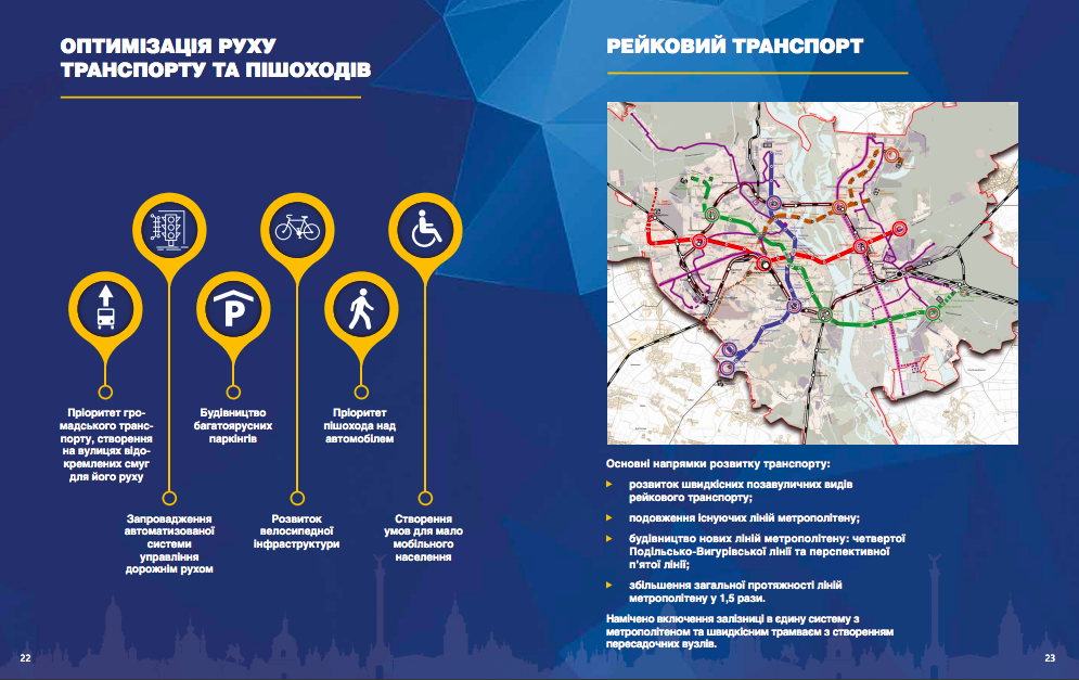
For now, a new plan that would already be in place is still being discussed. It provides for infrastructure development:
- public transport system development should unload the city's roads,
- an increase in the number of public spaces and green areas is expected.
However, the data shown to us are quite conditional. Even though the new General Plan, which was worked on by about 20 subcontracting institutes and organizations, is a document of 19 volumes or more than a hundred books, the City Council offered to settle for a small presentation.
However, to believe that the general plan will solve the problem of the non-aesthetic city appearance is wrong because the large-scale document depicts the strategic development of the city in terms of industrial areas, airports, railway stations, major arteries, residential and industrial buildings, recreational areas. That is, it doesn't answer the question of what the facade of a building should look like, what should be the tiles on the sidewalk, and so on. And so there are separate, more specific regulations.
More solutions for every citizen
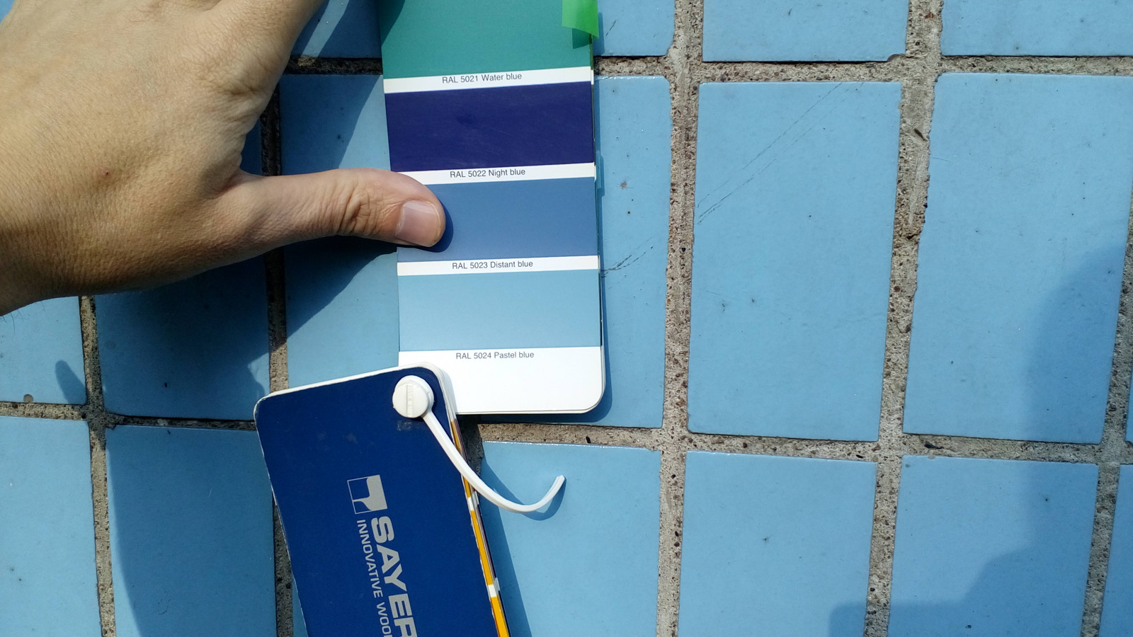
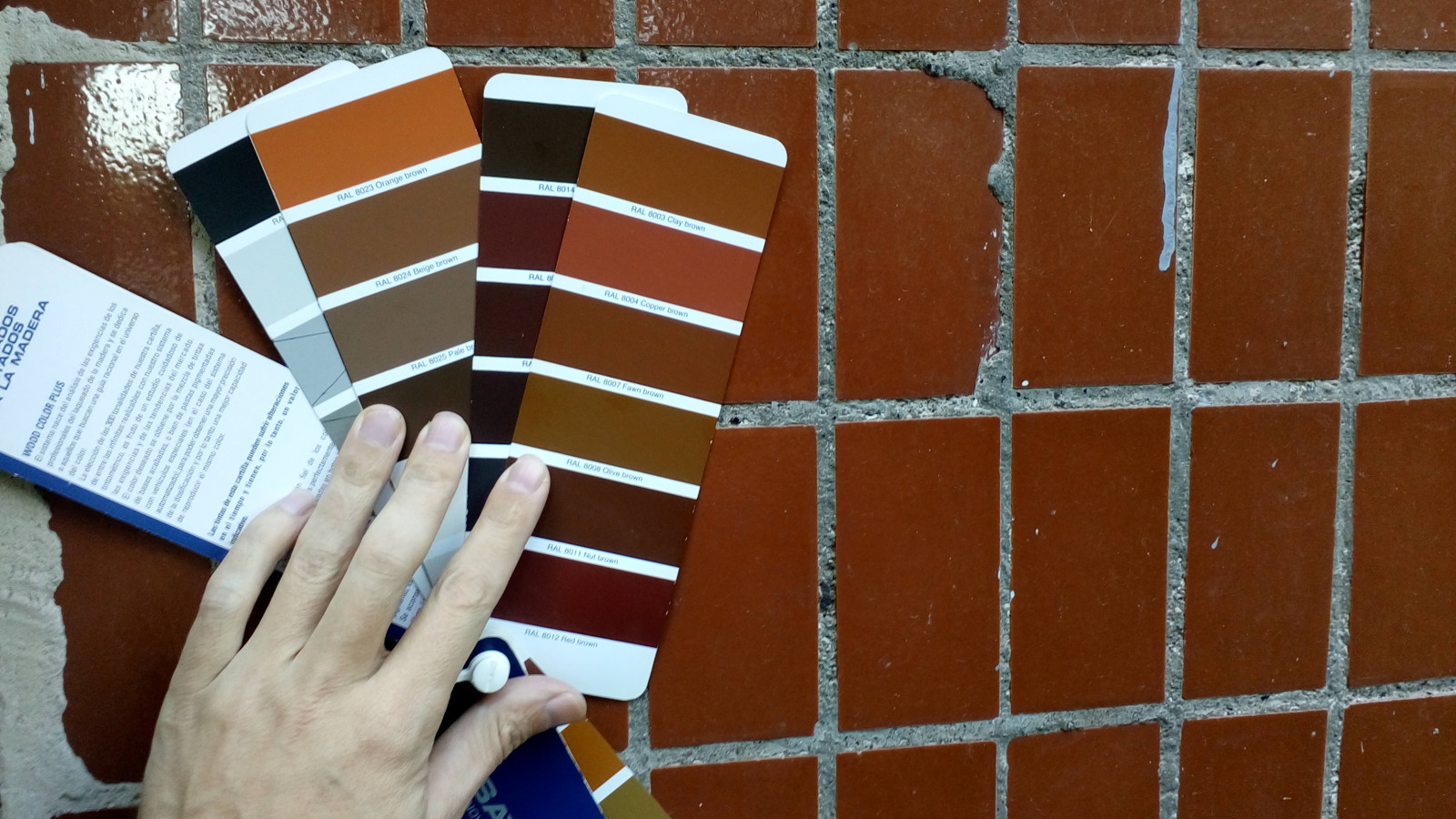
How can city residents affect the appearance of the streets? The answer is quite simple. You can start with your cooperative or home. Bohdan Hdal, whom we mentioned at the beginning of this section, developed a design code for a residential complex in Teremky, Kyiv, where he lives. It consists of the correct selection of paint for porches, the color of the tiles and the rules of its cleaning, the selection of colors for plastering insulated balconies, so that they don't look different, but combined. Each of us can start transforming our city with small steps.
To improve the appearance of your residential complex, you can follow the example of Bohdan and, like him, choose colors for plastering, painting walls, porches, and other parts of the building. Here are some tips we learned from his experience:
- You can choose the colors that were planned by the developer with the help of palettes. Bohdan used NCS (Natural Color System) and the German color standard RAL. NSC is designed for individual ordering of paints. RAL is an approximate but not always accurate alternative, based on which ready-made paints can be sold, which makes them much cheaper. With the help of palettes, you can determine the color of the plaster of the house before you insulate your apartment from the outside, or the color of the walls on the outside, before, for example, paint over graffiti.
- There is one important rule when painting graffiti over or updating the appearance of the porch. You shouldn't paint a ceramic tile as it spoils its appearance and considerably "cheapens" it. Graffiti can be washed off with solvents or devices that supply water or an aqueous mixture of sand under high pressure. Use paint only when the surface cannot be restored to its original appearance by cleaning.
- If the surface of the tile is quite damaged and there is no other method than painting, use solvent-based enamels. They hold better than water-based acrylic paints.
It would seem that simple rules, which, if followed, could significantly improve the appearance of many residential areas of the capital. This is something we can do on our own, without much expense and approval from local authorities.
Such small actions as attention to the rules of placement of signs and tablets, the correct choice of colors, of course, don't solve the global problems of the city, but significantly help to make the city more invisible to the visual perception.


